The mark, and what it carries.
We said we would not look away.
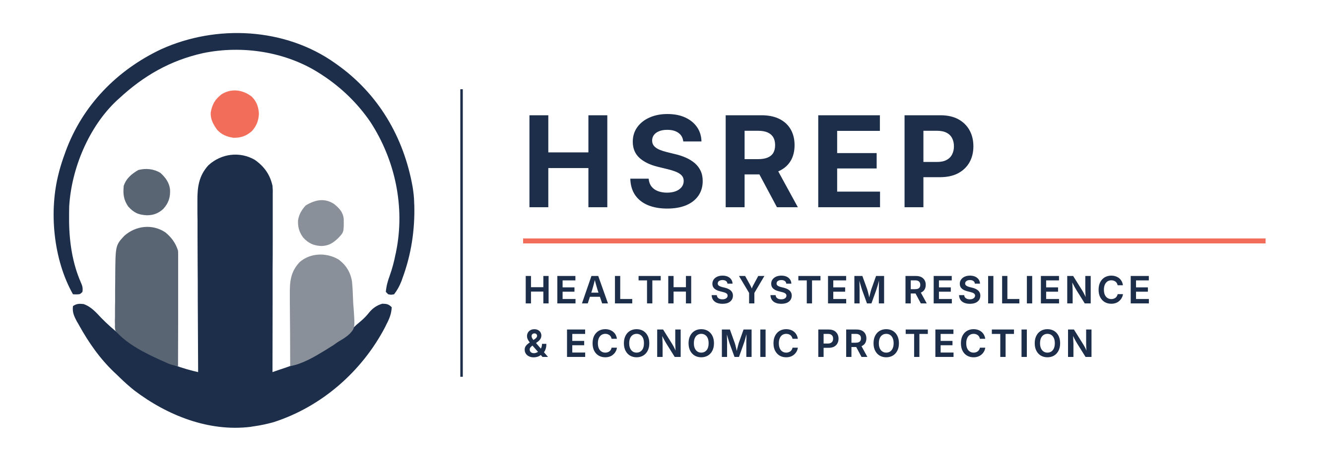
Every mark makes a promise.Ours is the Humanist Crest: protection built as a structure, with people at its centre.
The ground we built has learned to hold.
The base rises into the central figure.Protection and the person are one piece, built to bear load.A health system is what holds people up.
Three of us, and none the same.
Different heights, different tones, on purpose.People do not start from the same place.A real system holds all of them, not only the ones who fit.
An arch that never shuts.
The structure rises around them and stays open.Two gaps, so people can enter, leave and return.Protection that closes becomes a wall.
Alive.
Above everything, one coral point:the human spark the whole structure exists to protect.
And this is how we keep each other.
A foundation that bears load.People of every circumstance, held at the centre.Shelter that admits. One life above them all.That is the promise, and every page here is an attempt to keep it.
What the mark commits us to.
Human in purpose
The coral point sits above the structure because the person is the reason the structure exists. Every figure on this site is checked against whether it describes a person or only a request.
Systemic in method
The arch is drawn as infrastructure, not as a shield. Arguments are sourced, methods are published, and a number that falls is published beside the one that rose.
Protective in outcome
The foundation rises into the central figure because protection and the person are one form. Work that never reaches a clinic is a hobby; the initiative exists to close that gap.
One warm colour against one institutional one. Coral is never decoration: it marks the person, and it marks every action a reader can take.
Spectral
Display — arguments, headings, the things meant to be read slowly.Inter
Body — everything read at length.IBM Plex Mono
Labels — figures, sources, windows, and anything a machine produced.